Kemin unveils new logo, and vision
Food in Canada
Food In Canada Sustainability Ingredients & Additives growth ingredients Kemin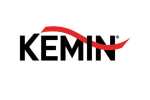
IOWA – Kemin Industries unveiled its new global vision and logo to align the company strategically for 2042 and beyond.
The new vision, “Kemin strives to sustainably transform the quality of life every day for 80 per cent of the world with our products and services,” is the groundwork for growth and priorities for the company with operations on six continents and a portfolio of more than 500 specialty ingredients. Previously, Kemin reached more than half of the world’s population at 3.8 billion lives every day through its products and services for humans, animals and pets.
By 2042, the world’s population will reach approximately 10 billion people. For Kemin to transform 80 per cent of the world’s population – approximately eight billion – people will encounter Kemin products five times each day.
“When we created our previous vision 20 years ago, it was ambitious and encompassed all aspects of our business. Since then, Kemin has grown ten-fold, and now the impact we can create is even greater,” said Chris Nelson, president and CEO, Kemin. “By using our scientific expertise at the molecular level and continuing to innovate, we have the ability to be transformative on a global scale in a rapidly changing and growing marketplace. With a new vision to guide us, we are reenergized to reach more people with our products and services to truly transform the quality of life around the world.”
Along with this vision, the new Kemin logo reflects the company’s focus on future growth while respecting its history through a thoughtful evolution of the Kemin brand identity.
“Our previous logo was encased with a thick, red circle in the signature Kemin red. Now without a border, the new logo represents transparency and innovation,” said Haley Stomp, senior vice president – worldwide marketing, Kemin. “The stylized ‘K’ remains, paying homage to the two previous Kemin logos. The red arch represents forward movement and calls attention to the ‘I’, emphasizing Kemin’s innovation. The ‘N’ behind the red arch represents the Nelson family who stands behind Kemin now, as they have since the company’s founding, and will continue to do so for generations to come.”
Print this page